
Welcome to Comparative Agility’s dynamic Polar Chart, a powerful visual tool that allows you to gain valuable insights into your organization’s performance. In this guide, we’ll walk you through the key parts of the Polar Chart, helping you make the most of this interactive and informative data visualization.
Overview of the Polar Chart
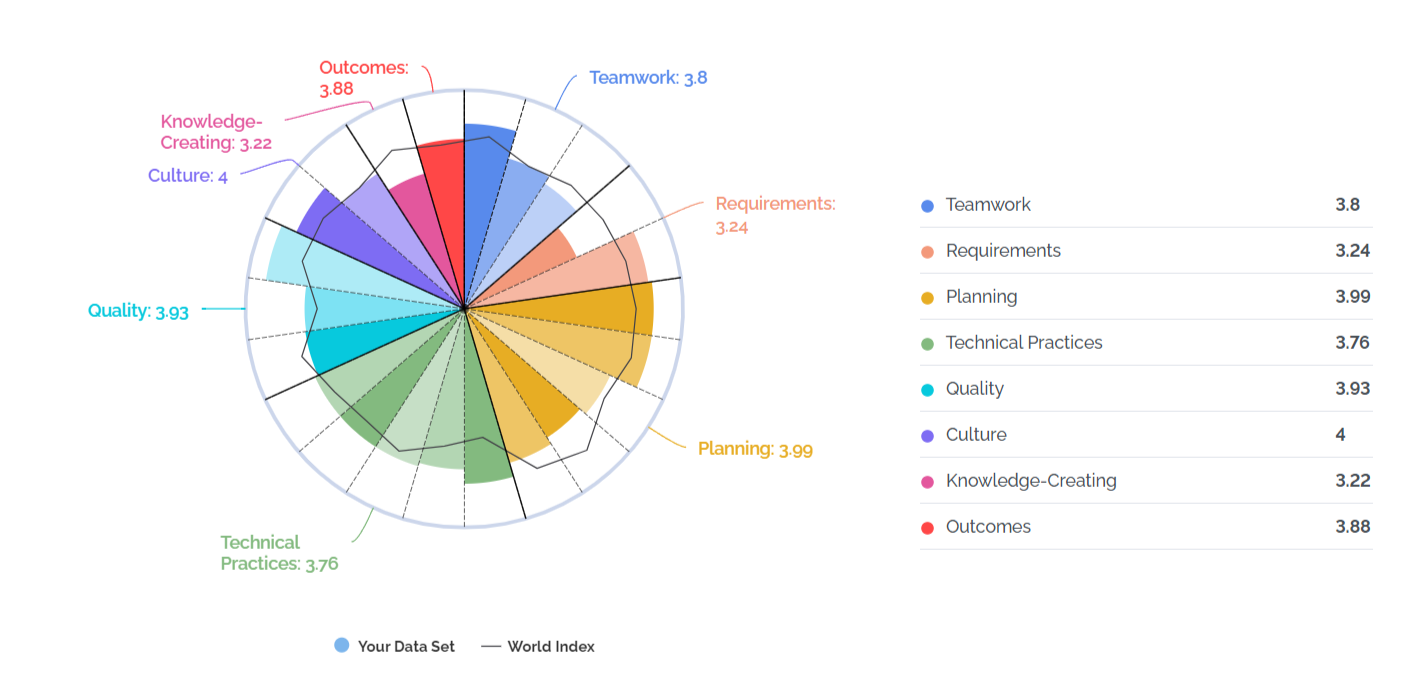
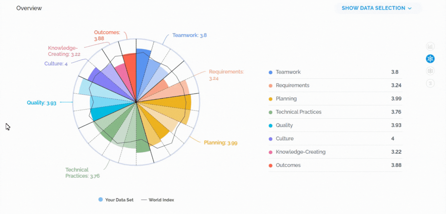
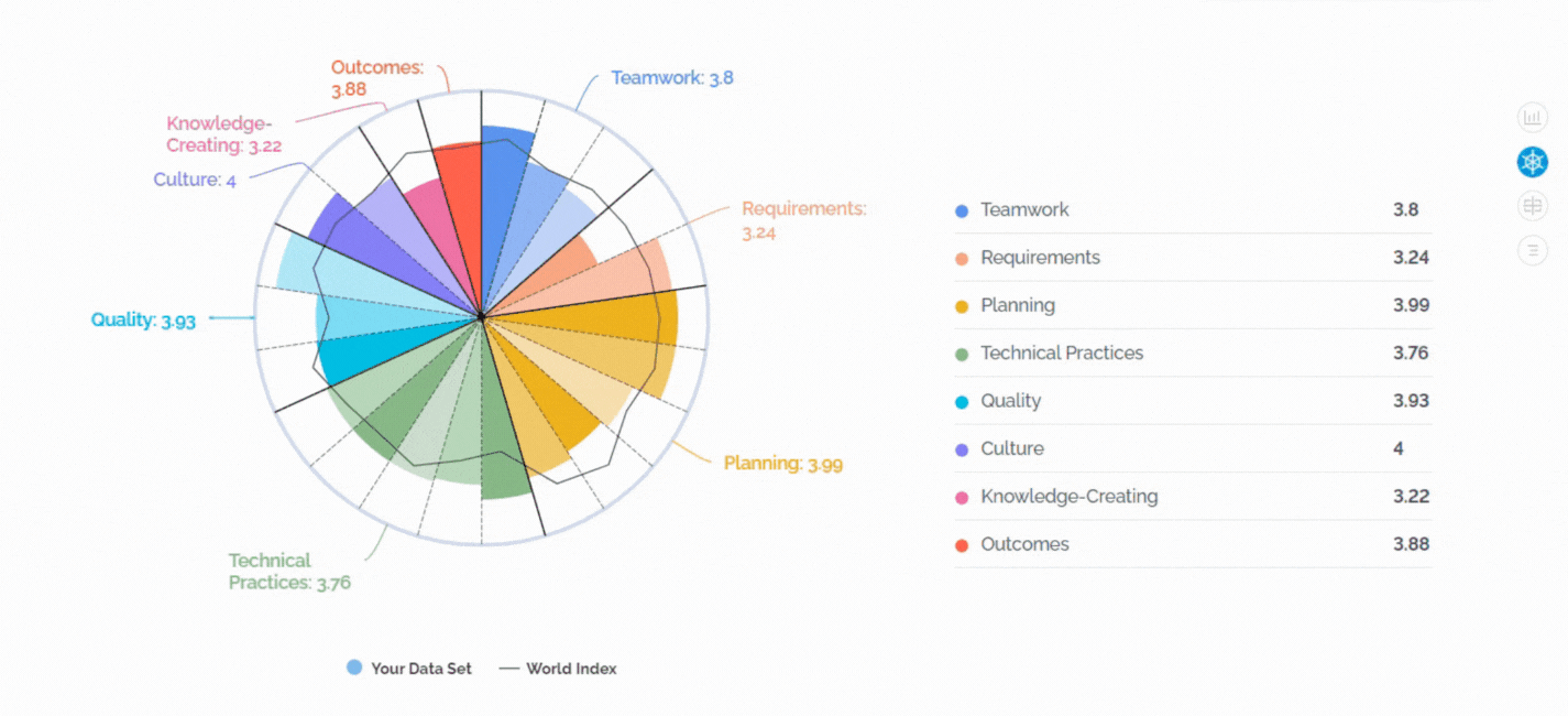
The Polar Chart is a unique visualization that offers a comprehensive view of your organization’s performance across different dimensions and characteristics. When you select the Polar Chart in your reports, you unlock a world of possibilities to analyze and compare data.
1. Toggling Between Dimensions and Characteristics
One of the standout features of the Polar Chart is the ability to toggle between dimensions and characteristics effortlessly. By simply clicking on them, you can dynamically switch between different aspects of your data, gaining a deeper understanding of your organization’s strengths and areas for improvement.
2. Toggling Your Data Set and World Index
The Polar Chart also allows you to toggle between your organization’s data set and the world index. This feature enables you to compare your performance not only internally but also against global benchmarks. It’s an invaluable tool for understanding where your organization stands on a broader scale.
How to Use the Polar Chart Effectively:
- Compare with the World: Toggle the World index to see how your organization compares globally. Identify areas where you excel and opportunities for improvement in comparison to the broader landscape.
- Internal Benchmarking: Switch between dimensions and characteristics to perform internal benchmarking. Understand how different aspects of your organization contribute to overall performance.
- Dynamic Exploration: Click on dimensions and characteristics to dynamically explore your data. Uncover insights that may guide strategic decisions and continuous improvement efforts.
- Shareable Insights: Utilize the Polar Chart to present visually compelling insights to stakeholders. Its interactive nature makes it easy to communicate complex data in a straightforward manner.
How to Access the Polar Chart:
- Navigate to your Comparative Agility reports.
- Select the Polar Chart visualization option.
- Begin toggling between dimensions, characteristics, data sets, and the world index to tailor your analysis.
Take advantage of the Polar Chart to elevate your data-driven decision-making and propel your organization toward greater agility and success. If you have any specific questions or need further assistance with the Polar Chart, don’t hesitate to reach out to our support team at support@comparativeagility.com. Happy exploring!